Show your followers what it looks like to become a member with your winery.
Read MoreVinescapes /
Share the Howell Mountain views with those that can’t visit.
Read MoreNew Releases /
Update your audience on what wines you have coming up in the release calendar.
Read MoreFour Days /
MY BOOKS ARE HERE!
I thought that was worth announcing with big letters because it’s kind of a big deal. Even though that piece of the puzzle has fallen into place, I still haven’t realized that I’m pretty much done with Recalibrate as a project. Yes, the publication is done. No more shoots, no more articles, no more layouts, no more changes, no more edits…I literally have two boxes of finished books sitting at my feet as I type this. That being said, I have yet to open the boxes and look inside. I think I might be nervous to do so. That may be the moment when it all hits me for real.
In the mean time, I’ve been grinding away (literally) on my table build. I feel like I’ve sanded away almost half the wood I started with and probably inhaled a fair share of that. Sorry to those of you who are going to be on me about safety when it comes to dust protection…I was bad at that during this project. Today I bought hardware for attaching the legs to the threaded inserts that I installed in the bottom of the table and it was so much more secure that I’d imagined! It’d be nearly impossible to get the two legs to be perfectly parallel with each other, especially when I have to consider that any given surface that I might put the table on may have slight variations which would make the bottom face not align anymore anyway. That being said, I’m planning to use shims in the gallery where needed in case the table needs the extra little bit of balance. I just finished wiping on the first coat of a tung oil and wipe-on poly mix as the finish for the table top and my lovely girlfriend sacrificed her leggings while staining my table legs jet black with India ink…sorry, babe.
My paper is here for printing my big prints so that’s on the schedule for tomorrow. Installation is on Tuesday and opening night is Saturday evening…just 10 days away. I remember fall quarter thinking I had 10 months…it’s amazing how this year has played out.
Alright, enough rambling, I better go open my boxes.
I might cry.
Thesis is Finished! /
I’ve done a terrible job of keeping things up to date here on the blog. Well, I’m laying in bed and Squarespace has a mobile app now so I’m trying out what it’s like to create content on the go…aka under my covers.
On Wednesday of this week I visited the print house and approved my final proof. That means that Recalibrate is finished and in production! YAY! It hasn’t hit me yet that that part of my year has been completed. I don’t think I’ll realize it until the book is in my hands, all 92 pages of it.
I’m in the process of building my display table which is a ridiculous task to begin with. Where did I get the idea to make my own table?? Well, I’m in it for good now and I’ll finish it…hopefully it won’t be too ugly to not set up in the gallery.
Finally, the prints I’d like to hang are in a mini hold-up because the paper to print isn’t here yet. I have my frames, backboard, glass, and images chosen so as soon as paper arrives then I’ll be cranking those out.
There’s the short of what I’ve been up to.
Again, Recalibrate will be shown on May 18 at 7 pm if any of you are interested in coming out for the gallery opening! I’d love to see you there!

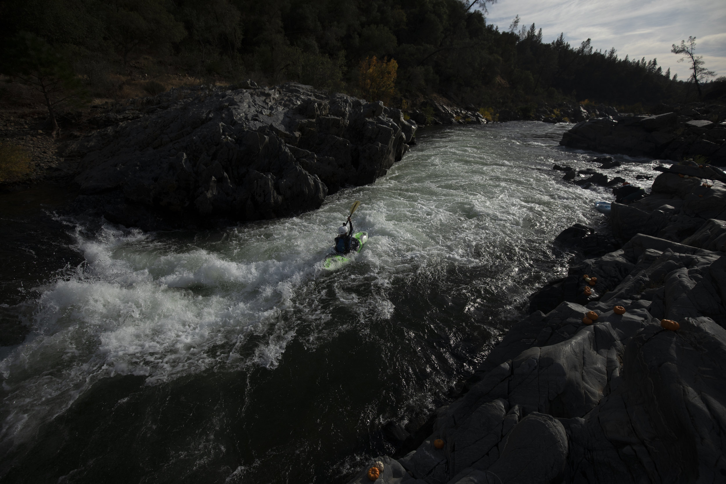
Mountain biking in the Palisades near Angwin
Conceptual Contrast /
Through the process of photographing the sports and locations for Recalibrate, I only felt conflicted about one shoot. This conflict was born out of a concern I had for the adherence to the conceptual narrative of my book.
Let me explain.
For a long time, I was scouting and planning a road biking shoot on Mount Tamalpais. All the while, in the back of my mind, I kept worrying that the presence of a road would somehow pervert the purity of the nature found in the other photoshoots. This thought kept making this future road biking shoot stick out in my mind as a shoot that wouldn’t fit in with the rest.
Well, I shot it anyway.
My friend, Matthew, and I rode the ridge of the North Bay mountain on a calm Friday afternoon. The weather was perfect and the company even better. During the early part of the ride, my mind kept going back to how I would shoot this location with the same message as the rest of the book. Yes, we were riding on a road and yes, there was the occasional car passing us by and hikers scattered throughout the fields, but it didn’t take long for me to realize that my worries had been unfounded. After vista upon vista of unobstructed roadside panoramas and pristine clearings of emerald green grass, I began to realize what characterized my message.
There are a plethora of paths that we humans can take to find a transformative experience in nature. It can happen anywhere, anytime, with anyone, any way, or any weather. I found my concerns of the road being drowned out by the awe I felt from the jaw dropping beauty we were surrounded by, the burning in my legs as they churned up the hills, and the realization that another person was sharing those same inspiring emotions.
Sure, my pictures from this excursion show evidence of human activity leaving irreversible changes to the landscape. My pictures also show an individual using what was available to him to be emotionally moved by doing something they love in a landscape so unique. That’s what Recalibrate is really about; connections, emotions, respect, and love of what we do.


Demo Forest /
One of my online influencers, Matt D’Avella, said this in a video the other day, “The small things you do every day are way more important than the things you do every once in a while.” It’s the small, repetitive and habit forming choices you make each and every day that amount to more in the long run than something bigger you might do every week or every month. I liked this a lot. Things like working out for half an hour, devotionals, connecting with friends, and even posting on this blog every day can be small pieces that contribute to a more balanced me.
There’s a nugget of what inspired me this week already.
Here’s an update on the thesis.
I shot some mountain biking in the Soquel Demonstration Forest this past weekend and it was the muddiest ride I’ve ever been on…by far. Even with all the mist, rain, and dirt, I had an absolute blast in this gorgeous place!
The weather may not have been optimal, but that’s not what getting outside is about. This weekend reminded me what this whole book is trying to say. Being outside is not about waiting for the conditions to suit you the best. It’s about taking full advantage of every aspect of Mother Nature and appreciating it to the fullest…rainy days or blue skies, clear roads or muddy trails, freezing cold or blazing hot.

Here’s a shot from our wildly messy ride. Legs were caked with mud from our shoes to our thighs and we all had thick strips of mud running up our backs.
I hope you all had a good weekend!
Cheers!
Side Projects /
Student show has been looming on my horizon for a little over a month now. Well, today is the day that all the pieces are due! I thought I’d give a little preview here on the blog as to the pieces I’m entering and a little background about the show for those of you that might not know what it is.
Here on campus, we have a small art gallery which hosts various shows throughout the year, most notably the faculty show, student show, and senior thesis show. In a few weeks time, the student show will be opening. This is an opportunity for students of all disciplines and all class levels to share some of their works with the local community. Lots of class projects get entered but there a few pieces which are side projects and those are sometimes the most fun to see. Side projects are a good representation of that artist because those are fully self-elected and self-driven.
I have 5 entries for the show this year. Three photography pieces, one woodworking project, and one embroidery piece. I’m not going to share all my photography pieces here but I’ll give a little preview of a few of the pieces.


This firs series of images is of my woodworking project. I’ve been working on an end grain cutting board for months and I got it wrapped up just in time for this show. Walnut surrounding an alternating pattern of maple and mahogany make up this checkered piece. It’s been a sheer pleasure to work with this medium and I honestly loved this process so much! I learned a TON and would love to keep making pieces like this. It’s pictured with a Japanese cleaver which I restored from a two-dollar thrift shop find a while back.


This image series is my only class project of the show. It’s conceptual series examining the struggles which we as individual internalize. I was hoping to capture the emotion and expression with which we would look at that struggle if we’d project it onto something outside of our minds. I’ve provided a more in-depth artist statement for the gallery so please come out and read it and really look closely at these portraits. It takes a careful examination of these shots to see what visual techniques I was looking for in this project.

This final preview is another completely non-photographic side project. I was inspired by Emily’s studio cross stitch project so I bought a hoop and some fabric and tried my hand at embroidery. This is a small Japanese cherry blossom branch which I stitched over spring break. In working on several of these stitching project in the past months, I’ve found the process to be very relaxing and soothing to work slowly with my hands.
For those of you in the area on April 18, please come out and support all the campus artists and visit the Rasmussen Art Gallery on opening night! There are some incredibly talented individuals submitting their work and it needs to be seen!
Hope you’ve enjoyed this peek at what I’ve been up to when I’m building Recalibrate.
Cheers!
Contents Update /
I did exactly what I didn’t want to do…stop blogging. I went on spring break and made the decision of not bringing my hard drive with me. Yes, it was intentional. I didn’t want to have the feeling of needing to work on my thesis while on break. But…in doing so, I left the blogging process behind as well.
I’m back at school and have a hefty to-do list for the next couple of weeks. Here’s a little idea of what I’m working on in the coming days:
Collect all my articles (3 more),
Shoot my last two outdoor adventures (not going to spoil those yet),
Send samples to the printer to get some different paper versions,
Match my articles with the best photoshoot,
Pace the book with an intentional order,
Finalize little nitty-gritty bits,
Send the final piece off to the print shop…
…ALL BEFORE MAY 1! That’s my deadline to have the file with the printer in order to have the product back in my hands in time to turn it in. After that’s off at the printer, I have to print my display pieces, build my display table, and assemble the final touches to the gallery setup. There’s a lot to do but it’s certainly manageable.
Today, I wanted to give an update on the contents page. The last time I posted about it, I had a completely fabricated version and a version with a photographic background. Since then I’ve taken aspects of each and combined them to come up with this version. I feel much more confident about this one but it is still subject to changes.
Click the image to view it without a white background…it helps see the boundaries of the spread.
Some feedback lead me to try make the coastline as recognizable as possible. Hopefully, readers will recognize that the complex line is the NorCal coast, but, if not, the small locator icon on the right will help explain the imagery.
If you have a very hard time interpreting what is going on, PLEASE TELL ME! I don’t want this to be confusing but my eyes aren’t fresh to this anymore so I really can’t be the judge of clarity in this situation.
In other news…you’ve helped me reach $950 towards executing the final steps! Thank you all so much for the ongoing support! I couldn’t ask for better family and friends.
Fear not, I’ll continue blogging as the weeks go by so STAY TUNED!
Cheers!
Nature Never Lets Me Down /
I checked my emails last night to find several more donations which more than doubled the donations I’d received before the weekend. I teared up a little bit, not only because the impact of the action, but from whom the donations came from. The support keeps coming from the most amazing people. I can’t thank you enough!
A Personal Anecdote
As a photographer, there are two less-than-desirable scenarios in which I find myself quite often; being in a picture-perfect moment without my camera and the alternative being that I lug my gear around and never have a reason to use it. More often than not, I default to bringing my gear with me for fear of being in a scenario where I regret not having it.
This weekend, I thought I’d take my girlfriend up Mt. St. Helena for the first time. It’s a hike that I’ve done dozens of times throughout my childhood and teenage years. I packed my gear, just in case. The sky showed heavy clouds which made for a pretty dramatic scene. However, once we got to the top, the sun was hidden, turning the dynamic sky sort of flat. Not only that, but it was probably low forties and windy as can be and our hands were thoroughly frozen. We got so cold that we started jogging down in order to warm up our bodies. Jogging with a DSLR, three lenses, a drone, and spare batteries on your back isn’t super great but I was motivated by the thought of being warm. I glanced left and stopped dead in my tracks and immediately whipped out my camera with a 100mm lens. Evleena was confused and then she followed my lens east over Hidden Valley and saw the beam of sunlight that had pierced the sky to light up a strip of the landscape. This was the first of two moments where I was thankful for my gear.

The sun retreated quickly and we got cold again so we continued our jog. Several switchbacks later, I saw an outcropping of rocks that was nicely framed by the valley behind it. I had Evleena scramble out to the highest point while I stayed behind her to grab a few shots. As she was stepping up to the point, the sun, again, started to sneak its way through the cloud cover and outline the hills in the valley. A few moments later the light came in full force, skimming over the coastal mountains and giving us a magnificent show of the beauty and power that balance each other every time the sun falls below the horizon.

Just as soon as it came, the sun retreated back behind the next layer of clouds and we kept on our way down the mountain…in awe of the display we had just witnessed.
Friday reminded me that carrying my gear on a day with no views is worth it just in case nature puts on a stunning show. There’s only a certain amount of predicting and planning that can be part of an outdoor photographers regimen. The rest is a combination of chance and preparation. I don’t make pictures like this because I know when and where to be. That only amounts to a small part of what goes into a piece like this. The rest is being flexible, being quick, and being in the right place at the right time with the right gear and the right people.
Let’s consider a few variables in this case. Had I not brought my camera, no picture. Had the wind not been so cold at the top, we wouldn’t have felt the need to run down the mountain and we would’ve missed this 5 minute window altogether, no picture. Had I gone hiking alone, hoping for a good view, I wouldn’t have the human element which adds so much to this scene, no picture. I could go on with a list of variables that had to be absolutely perfect in order for this moment to happen. Fate, chance, luck, whatever you might want to call it, I think God uses those sort of opportunities to remind us how powerful He is. I’m reminded of God’s glory when I am able to be part of a scene like this. It makes me feel so small and so insignificant, yet God put me in that space because, to Him, I am valuable.
What I’m trying to say is that none of the works that I create could even be remotely possible without Him who made such an incredible earth which we inhabit. We all owe it to Him to get outside and humble ourselves before the complexity of creation and realize that we, although immensely valuable, are but a small part of the masterful puzzle so carefully assembled by our Creator.
Get outside this week, breath some real air, and don’t forget your camera.
Cheers!
Favorite Picture in the Book? /
After crushing my two presentations and a 50 minute debate earlier this week, I finally had some time to get back into photo editing and laying out spreads. I have gotten to the point where I have all the shoots I’ve done laid out! I’d love to still do at least one more shoot, if not two. Six of the eight shoots have articles edited and laid out alongside them. That puts me at roughly 80 pages.
Whoa…80 pages! How did I end up here after starting the quarter with 0 pages?! I’ve come so far and it feels absolutely incredible! Thank you all again for continuing to give me feedback and following along with my process here on the blog.
I really enjoy blogging because it forces me to do several things. First, I find myself focusing on short, small victories so I have something to write about. Finding wins in little things is such a boost and fosters motivation so much more readily than getting caught up in big picture all the time. Second, blogging forces me to write things out, put my mind on paper (digital paper that is), and learn how to express myself through this medium. Writing my thoughts out has brought me to several epiphanies which I never would’ve arrived at without pushing myself to write. Thirdly, as a content creator (probably the most millenialized term out there), I love sharing my work and the process behind it. I, and you, will be able to look back at this collection and follow from start to finish the process I’ve recorded…and that’s pretty cool, I think.
Alright, let’s get to the reason you clicked on this post and the reason you even come to my blog; to see pictures. As I was editing this week, I came upon a photo from September last year which I already loved back then. I put a few edits on it and fell back in love with the shot. In the moment, there didn’t seem to be much action or point of interest but, once I framed up and composed the shot, the lines, textures, light, and perspective added up to something far greater than the sum of its parts.
Hope you like it.
Cheers!

Gotta Nail It /
I must start this post by expressing my deepest gratitude to those of you who contributed to Recalibrate in response to my latest post. After sharing my budget and my goals for the project, I received $300 from readers like you. WOW! I can’t thank you enough and it’s inspiring to feel the support behind my project. In case you still feel like supporting my project and want to contribute a few dollars, here’s a donate button!
If there’s one part of Recalibrate that I have to really get right, it’s the cover. Everyone says, ‘Don’t judge a book by its cover’ but, if we’re being honest, you all do it. I would dare to say you do it on a more regular basis than you imagine. Think about it. What about a book makes you want to look inside? The cover. I feel good about what I have for my cover so that’s in a good place.
I’ve done some exploring in my personal search for inspiration and I’ve done some book designing research and the general idea is that the second most important part of a publication is the contents page. I guess the ideology behind this is that if the contents page doesn’t effectively tell the reader what’s inside, they won’t feel like they want read on. My contents page has gone through a lot and I haven’t been happy with it yet…
Here are two versions of my contents page. I’ll show them to you before I explain my choices.


The concept here is to tie in my interest in geography. Both iterations show the contour of the Northern California coast line which, in my mind, is pretty identifiable. In case it isn’t, the little California overlay on the right side gives a contextual reference as to what the map is communicating. Each number on the maps represents the location of a photoshoot that I’ve done. Each number corresponds to an item in the contents list on the facing page where both page numbers and athletic activities are referenced.
I designed the first version a long time ago but never felt satisfied with it. I think it’s due to the fact that it doesn’t fit in with the rest of the book. Finally, I tried utilizing photographic imagery because I felt like that’s what was missing and that’s where the second version comes from. Neither version is completely doing it for me so I thought I’d see what kind of feedback I could get from you guys.
As I’ve been writing this post, I came to the realization that I DON’T NEED A CONTENTS PAGE!!! Why? This isn’t a commercial magazine. I’m not designing GQ and want my readers to be able to jump to the one section they’re interested in. On the contrary, I’m designing the book to be experienced as a whole, not jumped through at the readers volition. However, keeping this imagery contributes to my theme of geography and allows readers to see into my mind and think of things in terms of relationships to each other in the context of a map.
Basically, I’m stuck. If you had a gut reaction or first impression, I’d love to hear it because I’m way too far in to rely on a gut reaction anymore.
Cheers!
Make It Happen /
Overall, the process of working on Recalibrate has been an incredible team effort. I’ve adventured with my wildly talented friends who are always ready to push themselves and experience nature in a new way. We’ve gone climbing, white water rafting, bouldering, mountain biking, snowmobiling, trail running, and taken pictures the whole time. I’ve reached out to outdoor enthusiasts who have willingly written articles about their connection with Mother Nature. In the last week or two, I’ve solidified some design choices and started to reconnect with the printer that I talked to during fall quarter. Most recently, I’ve started brainstorming ideas for how I want to present my final project in the Rasmussen Gallery come mid-May. (See the post about my gallery presentation idea.)
I want to thank EVERYONE that has played such an integral part in creating something that I’m truly passionate about. I couldn’t have come this far without the unending support of my family, friends, and all those who are directly involved in working on Recalibrate.
The next steps are both exciting and daunting at the same time. Exciting, because Recalibrate is coming to fruition and seeing things come together is amazing! Daunting, because the physical production process and display construction is an inevitable financial investment.
That’s where you come in!
Friends, family, friends of friends, whoever you may be and however you found yourself here, I’m asking for your support in meeting my goals for this project. I’ve come up with a budget for the final phases of Recalibrate which is just shy of $1,500. Below I’ve laid out the estimated and foreseeable costs of producing my senior thesis.
Printing costs: $600-$700 (variation due to uncertain page count)
Display table supplies: $400 (lumber, leg pieces and fittings)
Gallery printing and frames: $200 (frames, mat boards, glass, hardware)
Display accessories: $150 (statement cards, table decor)
This project has already been a crowdsourced miracle and I can’t wait to be able to share it with all of you! If you believe in supporting young artists, I would love your consideration. As a thank you to everyone who contributes to the next steps in producing Recalibrate, here’s what I’ll give you to express my appreciation:
$25 donation: limited edition 8x10 print of an image from Recalibrate
$100 donation: copy of the final edition of Recalibrate
Thank you again for all the support I’ve received from my readers. The feedback I’ve gotten is amazing and I couldn’t have asked for a better support system.
I owe this project to all of you.
Cheers!

Here’s a shot from the NorCal coast this past weekend. I’m NEVER let down when I get out to this rugged and untamed landscape.
For those who may be on my blog for the first time, please read through my recent posts to learn about my project and feel free to follow the process throughout the next couple weeks and months. Find updates on my Facebook and Instagram.
Eric the Printer /
Yesterday, I went to Santa Rosa to meet with Eric, the president of ChromaGraphics which is a commercial printing operation with a very wide range of print media. I brought in some samples from books I’ve found inspiring as well as a long list of questions about the printing process and their operation. Eric was fantastic and gave me so much information!
We talked about paper stock and paper finish which I’ll explain in a following post. He gave me samples of cover and text options (also expounded upon in a coming post). He estimated that production time for my order would be about a week and that, for a book my size, it would cost me somewhere around $600. He suggested strategies for designing my cover in order to make the binding process as successful as possible. For example, not having border lines of images right at folding seams going from the front/back onto the spine. I had already avoided that problem by designing my cover so that the image wraps all the way around the spine and bleeds onto the back.
Probably the most impressive part of the whole meeting was when Eric took me to the warehouse and showed me their newest piece of printing technology; a behemoth of a machine the size of my dorm room with ten-thousand print heads all spitting ink in a more efficient and more accurate process than anything else available. Fun fact: the printer that will be printing Recalibrate is the only one of its kind west of the Mississippi.
I’m very excited to have made that connection yesterday. Working with real people in a professional setting is one of the aspects of producing Recalibrate that I will value most. One option would be to upload a pdf online to some company in the midwest and wait for the final product to show up a couple weeks later. However, I love the process of talking with Eric about papers, finishes, design strategies, processing, and just being part of the production. I will learn a ton through this process and it will make me a better photography, designer, publisher in the end.
On another note, I dug back into the albums from earlier shoots from fall quarter and did some editing so I could continue laying out spreads. I’ve learned a valuable lesson this year; never discount the potential of an image due to what appears in camera. Of course, this creates a dangerous dichotomy which can be taken advantage of with the notion of ‘I’ll fix it in post’ syndrome. However, when I keep this reminder in the back of my head, it keeps me from being discouraged when out shoot and even when I get a first look at my images. In the past, I’ve written off pictures at a glance because of the way they come out of the camera. This year, however, I’ve learned the true power behind some of the editing technology at my disposal.
Here is an example of an image which I would’ve been quick to mark unusable, however, with the right adjustments, the information is there to create a pretty expressive moment.

Thanks for following along on my journey of new experiences and professional growth.
Cheers!
I Made a Cover /
Since deciding on a name, I felt it was time to look at some cover options. Because Recalibrate is a multi-sport photography journal, I nixed my idea from months ago of not having a photograph on the front. That just didn’t make sense to me, being a predominately photography-based piece. The multi-sport aspect had me thinking that I ought to feature a picture that shows my key elements, athletes and nature, while also not creating assumptions about the books content. I worry that if I have a photo of a climber or a mountain biker, people will see the cover and assume that it’s a climbing or mountain biking book. I looked through some of my supporting imagery to find images that met all three of those criterion.
I found a shot from a climbing trip I did with Reuben and Natalia late last summer. I took it before sunrise after camping part way up the approach to a climb called Cosmic Wall in Castle Crags State Park just south of Mount Shasta. It shows Reuben, nicely framed between two granite features, carrying his gear for the excursion as we continued our trek up the mountain. The hazy morning colors behind him were softened by the smoke of the Hertz fire burning just one ridge away from where we were going to climb.
Composition is a huge part of what drew me to this shot. The positive and negative space are almost the reciprocal of each other which creates a tense, yet symmetrical balance. It’s easy to pick out the subject, yet the human element isn’t dominating the frame.
Here’s a look at the cover I came up with based on this image. I realized that the word recalibrate had the four letters ‘cali’ in it…which I couldn’t help but try make stand out in this first edition. I haven’t personally decided if that comes across as tacky or if it’s another connection to the region, geography, and landscape that has made this book what it is.

I did print the front and back cover and attached it to a scrap magazine to try and visualize it in a tactile way. It worked really well! Trying to project this image on a physical book is difficult when it is currently displayed to you on a screen which is most likely smaller than a dollar bill. However, I downloaded a free mockup online just to give you a slightly more realistic reproduction but this is still nothing like it is to hold the image on the cover of a book.

I’d love some feedback on what you think of the cover image, layout, and design. Let me know what you think in the comments!
Excited to see the next steps coming together!
Cheers!
What's the Thesis Name /
I thought for a while that naming my thesis project would be a difficult task. How do you come up with a title that will encapsulate the message that you want to share? How do you simplify the sentiments of a project into a single word or short phrase?
Turns out I was able to generate some concepts without too much strife. Part of what helped me gain direction was reading through the articles I’d received from my writers. Many of them had a string of thought that they all shared; nature is a place they go not only to practice their sport, but in doing so, reconnect with who they are.
With this concept in mind, I made a list of words that I felt expressed that sentiment: restore, restart, refresh, rejuvenate, and reconnect are a few of them. Ultimately, I felt drawn to the word recalibrate. This word gives me a sense of connection to why I choose to go outside. Life can hit hard sometimes. I end up feeling broken, confused, weary, rundown, and lost. Sometimes my mind convinces myself that I’m stuck and alone in a vast world which remains unchanged by my individual efforts.
It’s those times where the only fix is to get out. It’s amazing how much direction and clarity I can gain from getting away from the routine of daily life. Sometimes the only way to change the feeling of being lost in my own mind is to truly get lost in a world that’s far more magnificent than anything else human kind has begun to imagine. I can try as I might to find direction from within myself but nothing resets my mind like experiencing creation the way it’s meant to be experienced; heart pumping, lungs burning, muscles screaming. Moments like this show the true power and majesty of the natural world while simultaneously Mother Nature lends herself to be a beautifully woven tapestry on which I push and search for peace and restoration. At the end of the day, I come away challenged and renewed, blessed and de-stressed, inspired and redirected, connected and empowered…recalibrated.
Recalibrate is a collaborative expression of these feelings. It’s a book about people seeking restoration…
…and finding it.

The experience behind this picture is a manifestation of what I’ve described. There is no trail to this location, only a ridge so steep that you have to use your hands to pull on thigh-high grass to get yourself up. It had poured the day before and that left the mountain side soaked with water. We were up before 4 am and spent the next two hours with headlamps on, soaked from the waist down, pulling our way up the ridge. We were gettin towards the top but from our vantage point, the top was shrouded in a massive cloud that was slammed against the other side of the ridge. Rarely is a physical battle with nature not worth it so we continued to the top. We beat the sun stood at the top in a cloud while we waited for sunrise. In a matter of minutes, the tail of the cloud brushed past us leaving us quite speechless.
My description my seem too good to be true. It was. I look at the pictures and I have a reaction which takes me to the sheer wonder we felt on the ridge that morning. That feeling of awe has repeatedly captured my being throughout the journey of creating this project.
When you feel lost, broken, stuck, and disconnected, get outside.
Push harder.
Go farther.
Recalibrate.
Gallery Display /
With the brainstorming power of some other creative minds, (mostly my sister, Emily) I have a good idea for how I want to present my coffee table book in the gallery in May. Since a coffee table book might be a difficult piece to display in a large, primarily empty room, I was struggling coming up with an idea for how to make the presentation physically bigger than the size of a magazine. Emily had the idea of building a table that could be cohesive with the style of location where I could imagine my book being placed. I looked into materials and styles of tables and I like the idea of a heavy wood-topped, bar-style table (high and long) with galvanized steel piping as the legs and support.
When it comes to the placement of the table in the gallery, setting up in a corner with the table a few feet away from both walls will create three dimensional space to act as a ‘room’ surrounding the display. Visitors can walk all the way around the table allowing for people to be on both sides looking through the books. On the walls emanating from the corner, I want to hang a few of the strongest images from within the book to help establish the ‘room’ feeling. To round it all out, I’ll place some modern, yet homey, decorative elements on the table to contribute the presence of the display. I did a little bit of 3D modeling (this took 5-ever to figure out) to get a sense of what I’m imagining and I think it could look really nice if I can get this made. Here’s a screen grab of the modeling so you have an idea.

The current table model is an unconventional table top. It consists of 2 4x8 pieces of lumber sitting two inches apart, braced together by 5 joints spanning the length of the table top. Current concept is to use Mendocino Redwood for the main lumber and join it with a contrasting wood. The redwood pays homage to Northern California, following along with the book. Conceptually, the two halves of the top represent nature and the athlete with the connecting joiners being sport.
Let me know what you think of this idea and what I could do to make it better (in your mind).
Cheers
Contours /
As a very spacial-minded individual, I’m fascinated by the shapes of geography, the steepness of mountains, how one place relates to the next, and what that means for the landscape. Because of those curiosities, maps are one of my favorite things to explore when I can’t be out and about. That little personal trait has lead me to want to incorporate map type imagery in my thesis project.
I’ve worked on some contour line graphics that will be a subtle accent to my layout and design process. Here’s a little step by step for my process in generating this imagery.

First, I start a document in photoshop and run a filter which generates clouds based on my foreground and background colors (black and white in this case).

Next I put a slight blur on the clouds to make my future lines smoother and less rigid.

A posterize adjustment allows me to tell the program how many layers I want it to separate the image into. In this example, is chose 16. Higher numbers mean more layers which mean ultimately more lines. (If I would do a number like 2, it would separate my gradated clouds into black and white, two layers.)

This is the fun part where it starts to look how I want it! Another filter, find edges, automatically generates lines where the edges of every color change existed. This is the end of our journey with photoshop.

I copied and pasted the pixel layer into Illustrator and ran an image trace on the content. This tells Illustrator to built a vector line wherever it finds an existing line. (Vector lines allow me to edit each and every line individually in the long run as well as to scale up or down the graphics with no loss of quality like when working with pixel art.)

I constructed some custom brushes to apply as the stroke for some of the lines. This is to give the feeling of elevation markers to the contour graphic.

I applied the custom brushes as well as a custom dashed line for some variety.

Here is a zoomed in look at the texture.
Click to enlarge
I saved the graphic as an asset in my creative cloud libraries and linked it as the background to this page in my layouts in Indesign. Linking this way allows me to go back and forth and make edits to objects in my layouts and have them automatically update with new edits.
Of course, this geographic location is a place of mystery, but I like the sensation is alludes to with the subtle imagery.
As I think I’ve mentioned before, my struggle of recent has been trying to have written content unrelated to the images that are found around it. I’m currently experimenting with having all my articles on pages that don’t have images to try separate them a little bit. I’m also looking at using the contour texture behind the articles to give one more degree of separation from the images. Image series will also have the small captions, maps, and geographic coordinates to establish the series as a separate entity from the articles.
Let me know what you think of the texture and if you think it’s working or not!
Cheers
Progress Feels Good! /
I realize that almost two months have passed since my last post…
…oops.
Since then, I had finals, went to New Zealand and Australia, tried snowmobiling for the first time, and made tons of progress on my thesis project!
Here a few snaps from my time down under. Only a few are edited as taking on each image can make for a daunting task that takes over an hour sometimes.


I gained an extra kick of motivation once school started up again and it pushed me to begin the layout process of my magazine.
First, let’s clear something up. When I say magazine, I do not mean in the sense of a thin, floppy, extra-glossy GQ or Nat Geo style magazine. I mean more of a coffee table book. A product that feels good in your hands and is something you keep laying around to leaf through because it’s beautiful, not something you flip through once and discard.
I had talked to some of the people I admire when it comes to outdoor adventure lifestyle about writing brief articles for me just before the break. A couple weeks ago, I started to receive those pieces and I felt like I could start laying out some spreads.
In the last two weeks I’ve gone from 6 shoots and 0 pages to 8 shoots and 36 pages. I have plenty more bulk layout to do and tons of photo editing. However, seeing such progress is incredibly encouraging.
I’m currently waiting for more written submissions to come in so that I can keep pairing them with shoots and getting spreads generated.
Just to get an idea, here is a peak at a few spreads. Again, photos need editing for cohesiveness but that will come closer to overall layout completion.


Thanks for checking in! Stay tuned for another update on conceptual development because that has progressed significantly as well.
Cheers!
Mind Map /
For several weeks now, I would say that I’ve been in a sort of creative limbo; not ready to take the leap of moving on to the next step.
When it comes to shooting the kind of outdoor scenes and activities that I’m after, countless variables come into play. Of course, I’m relying on another person, weather can make or break my shots (not to mention smoke), time of day determines the vibe of the story, and other people or crowds can cause other problems.
The next step is layout and design and I am set to get that under way before the next break from school.
I’d love to use geography as the thread that runs throughout the book. I’m a very spacial thinker and feel drawn to relating things to each other in a physical way. Design elements like line maps, topographical imagery, and latitude and longitude coordinates are ways that I can bring the individual stories together. I'm working on exploring how to create those design elements.
I’m gone all Christmas which is somewhat inopportune when it comes to having several weeks to get some good work done on my project. Stay tuned for some New Zealand and Australia pictures while I’m traveling!
In the mean time, enjoy that last fall colors of our beautiful valley before the rains.
Cheers.
